I’ve been working on a graphing project for the Astoria Digital volunteer group in collaboration with Muckrock. The app will visualize data around New York’s 50a police disciplinary record requests.
My first task was a proof of concept - to put some very basic data in a bar chart. The data has a single axis: how much each request cost. We only care about unique costs for the purposes of this visualization, so the list ended up being only 19 values.
[
  "$47,504.00"
  "$30,815.00"
  "$20,510.00"
  "$5,000.00"
  "$846.16"
  "$250.00"
  "$244.66"
  "$200.00"
  "$56.15"
  "$36.00"
  "$28.00"
  "$27.25"
  "$19.39"
  "$17.50"
  "$14.75"
  "$13.25"
  "$8.75"
  "$7.50"
  "$3.00"
]
The goal is to show each value in relation to each other with a good old fashioned bar chart. Since the project was already using React, I decided to go with nivo as the graphing library, which uses d3 under the hood.
That’s when things started to get interesting, and by interesting I mean unexpected, and by unexpected I mean annoying.
Nivo has lots of documentation, with a really slick display, interactive widgets and lots of examples on how to solve complex problems. However, noticeably lacking is much documentation around how to solve simple problems, like implementing a dead simple bar chart. Equally missing is a robust getting started document, or a explanation of the architecture of the library, key concepts, assumptions, and the like.
Irritating, but fine. I’ve been doing web development long enough not to be scared away. I dug in, and while it took me longer than I would have liked to piece together what I actually needed for my little bar chart, I had a working widget.
<Bar
  width={800}
  height={500}
  layout="horizontal"
  data={prices}
/>
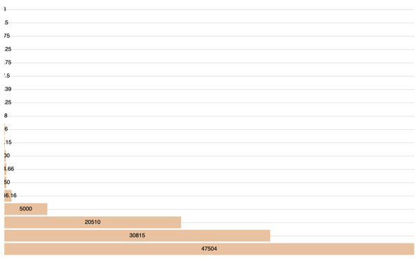
Well, working was a bit of an overstatement. While it rendered, it looked, well, off.

Was my data wrong? I double and triple checked it, throwing
console.logs all over the place. Everything seemed fine.
After some careful eyeballing, it seemed like the issue was not that the data was wrong, but that the display was being cut off.
I checked the nivo documentation - maybe I missed a vital configuration? Some CSS file I needed to include? Where’s the option for “render correctly”?
Unfortunately all I found was very fancy how-tos on how to render multi-colored bars with multi-layered data and lots of animations. Cool stuff, but not helpful here.
I was starting to get frustrated. How hard could it be to render a dead simple bar chart?
I tried extending the width and height attributes on the chart,
but that only made the SVG canvas bigger, leaving in tact the cut-off
values.
Finally, I broke down and started digging into nivo’s code.
The work
While I couldn’t find any documentation on it, maybe there was a CSS file I needed to include? I poked around in the SVG source that nivo generates, and noticed that the SVG elements did not include any classes or ids. That hinted that there was no default CSS file to include, but to check my assumption, I searched the entire node package for any CSS file.
find ./node_modules/@nivo/ -type f -name "*.css"
That returned no results, so I could confidently cross off “forgot to include library CSS file” from my debugging checklist.
If there was no external CSS library expected, the chart would have to be styled another way. SVGs have lots of styling effects via the use of properties; maybe something in there was amiss? Seemed like a stretch that there was a bug in the library for rendering such a simple graphic, but I didn’t have any better ideas, so I started combing through the SVG markup.
I didn’t notice anything strange about the SVG properties, but I did needs more styling power than pure SVG, and since it isn’t using an
That made me challenge a core assumption I had been making: that the
library was smart enough to fit the data given inside the SVG canvas.
After checking the API documentation again with my new hypothesis
goggles, I found the margin property, with this description:
Chart margin.
Not exactly the clarification I was hoping for, but my new theory was docs search found no method of passing in custom CSS class/id values) and values being cut off is essentially an offset issue, I figured that
I slapped that sucker on the component, and sure enough, it fixed the
issue. My assumption was (unfortunately) correct; you have to explicitly
set margins for your simple bar chart, otherwise nivo might not
display it properly.
This would have been really helpful to have outlined in a core concept document, and was rather disheartening, because it meant that component configuration is tied directly to the shape of the data, adding a maintenance headache. However, it worked, and that issue was for future Chris to deal with.
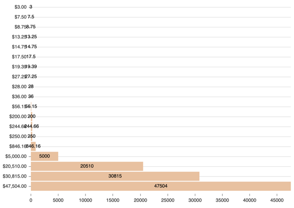
Unfortunately, I wasn’t completely done. Since my chart was so simple, containing only one value column, I wanted to simplify the display. By default, the nivo chart outputs x and y axis labels, as well as a label overlaying the bar itself. This is great for complex, multi-axis data, but for a simple chart like this was entirely redundant, and also caused overlapping values because of the vast differentials between them.

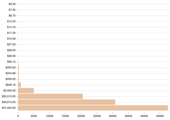
My ideal state was to hide the x and y axis displays, and just use the label overlaying the bar, since the data isn’t relational. However, nivo does not present an option for this. It does provide an option for hiding the overlay labels, so I went with that.
That fixed the overlapping data issue, yet the y axis was still redundant and potentially confusing.

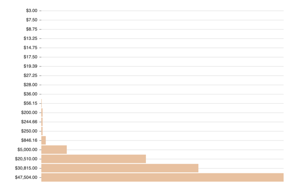
Again, nivo offers no way to hide this display, so I turned to the dark arts: hacky CSS.
Since nivo doesn’t supply unique identifiers for elements, nor does it supply a method to pass in your own, I resorted to this monstrosity:
.headline__costs + svg > g > g:nth-child(2) {
  display: none;
}
Eagle-eyed CSS-folk will have noticed that this code is brittle as hell; if the nivo library changes how it outputs it’s SVG markup, say, moving the y axis to be the first child instead of the second, this code will hide the wrong element.
That being said, this works for now, and provides some real value by making the data visualization more clear.

Conclusion
And that’s my journey with nivo so far; an impressive library with lots slick functionality, but some strange omissions around dynamically rendering data shapes and a lack of basic documentation.
In closing, nivo does:
- Render SVGs using only inline CSS
- Allow some style tweaks to that inline CSS via component properties
- Allows hiding overlay labels
Nivo does not:
- Automatically render chars so that all given data is visible (offsets must be manually set via the
marginproperty for each dataset) - Provide getting started documentation aimed at new users
- Provide documentation on core concepts for how the library functions
- Make rendering a simple bar chart simple (oooh, :hot_pepper:!)
Thanks for reading!